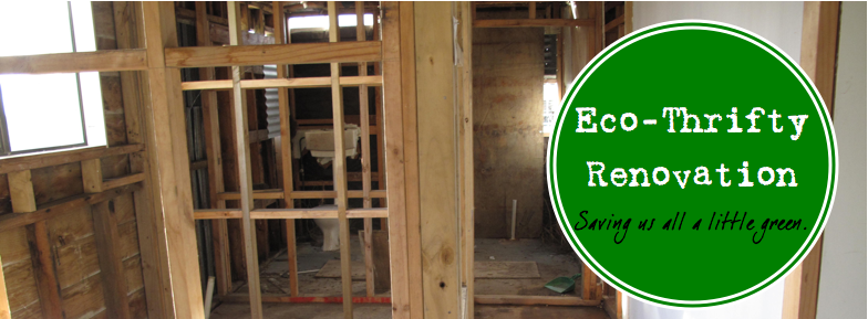
We are planning to use earth plaster to cover the walls in the majority of the house, but are using paint to cover the walls in the two "wet" areas. We are doing this out of the need to complete these areas fully before our building consent expires. The areas that can wait a bit longer will get the earth plaster treatment in due time. (Due time being within the next few months, or year, or 18 months…).
I know that MC already mentioned our addiction to Grand Designs. Thanks to a special delivery from our neighbor and the aforementioned sinus attack, we've been watching a lot of Grand Designs episodes lately. A lot, a lot. And I have to say that the major lesson I've learned from Kevin McCloud, as he gracefully talks us through projects that didn't quite work out, and ones that were a great success, is that design is intentional.

Our approach to interior design thus far has been less than intentional. Gathering bits from op shops and auctions has left us with a rather eclectic bunch of materials to work with. We have gold curtains, a kiwiana mint green stove, and two beautiful leadlight cabinet doors with various shades of blue.

Once the idea of paint colors came to the foreground it became apparent that I would need to do some designing to pull together all of the elements. Otherwise, as Kevin says, it might come off looking like a "dog's breakfast" or even worse a "pig's ear". Neither of which are desirable, by the way.
In my internet travels I came across a site called Pinterest. If you love inspiration boards (I do), if you love design (I do), or if you just simply love finding new random things on the internet (I do), then this is the site for you.
Scrolling through all sorts of inspiration I have created a folder about our kitchen. It features some of these beautiful ideas:


And even more if you can believe it. They have led me to create this mock up of our kitchen design:

Yes. I am a huge nerd.
So what do you think? Pig's Ear? Dog's Breakfast? or the sweet accomplishment of a successful design? Am I wrong in thinking that light blue is the tie together color for our kitchen? Is there another option that stands out to you? We'll see once we get the sample up on the wall. But if you have any thoughts in the mean time, please share them.

- June Cleverer

hmmm... is it too late to comment? i think the blue you chose might look garish behind the kiwiana stove color...What if you chose a gold color that is MUCH lighter than the gold curtain? A happy color... or a tan...or stripes! of each of the colors! or WALLpaper. Just kidding. But I am serious about the shade of blue you chose. If you choose blue I think it ought to be much paler, with tones of gray in it...but I'm not a colorist. Or GRAY with a little tint of blue in it? Like the color of the lead in the glass. Aren't you sorry you asked???
ReplyDelete